Colors
Color is a critical part of our brand and we use it to enhance our communications and to inspire our communities. We strive to create a color palette that provides balance between expression and accessibility. As a healthcare organization, we aim to include as many people as possible in our print, digital and environmental experiences.
Brand
Accessibility Palette
The accessibility color palette is an extension of our primary brand. It considers accessibility in digital experiences such as websites, social media, screensavers and presentations. It can also be used in print projects when accessibility is a concern. When selecting colors, it is important to maintain enough contrast between the background and critical text and visuals in the foreground. When using the color palette, lead with the primary brand colors in our palette. It is recommended to stay within the color wedge (example: use dark blue text on pastel blue background).
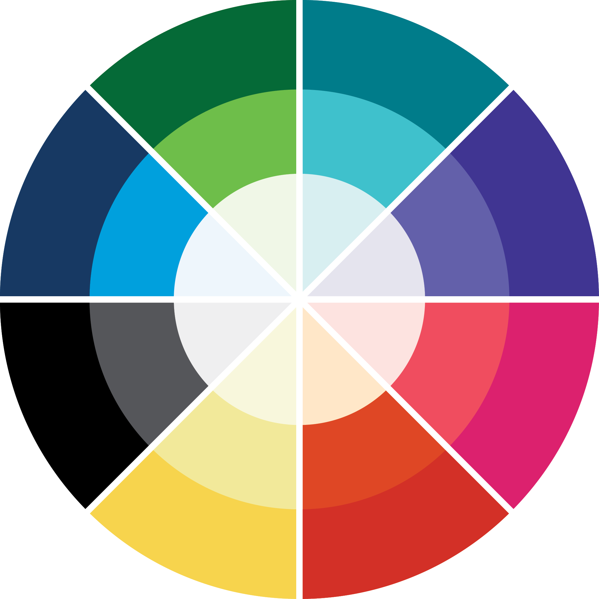
Outer Layer
The colors on the outer layer of the wheel are preferred for accessibility. These colors are best with white text overlaid or as text colors on white or light backgrounds.
Middle Layer
When using the colors in the middle layer ensure text is large headline-sized in order to pass accessibility tests.
Inner Layer
The colors in this row should be used as backgrounds or as text colors on outer layer colored backgrounds.
Yellow Exception
The yellow wedge of the color wheel is an exception; use yellow as background colors or set text to yellow if on a dark background.
Dark Blue
PMS 2955
CMYK 100 78 36 28
RGB 0 55 100
HEX #003764
Blue
PMS 299
CMYK 80 18 0 0
RGB 0 160 221
HEX #00A0DD
Pastel Blue
PMS 299 (10%)
CMYK 10 1 0 0
RGB 225 240 251
HEX #E1F0FB
Dark Green
PMS 349
CMYK 90 33 100 26
RGB 2 105 55
HEX #026937
Green
PMS 360
CMYK 61 0 96 0
RGB 108 192 74
HEX #6CC04A
Pastel Green
PMS 360 (10%)
CMYK 5 0 10 0
RGB 240 247 232
HEX #F0F7E8
Dark Teal
PMS 7713
CMYK 100 0 29 24
RGB 0 125 138
HEX #007D8A
Teal
PMS 319
CMYK 65 0 22 0
RGB 38 202 211
HEX #26CAD3
Pastel Teal
PMS 319 (20%)
CMYK 15 0 5 0
RGB 214 238 240
HEX #D6EEF0
Dark Purple
PMS 2735
CMYK 95 95 3 0
RGB 64 50 147
HEX #403293
Purple
PMS 2725
CMYK 69 70 0 0
RGB 103 93 198
HEX #675DC6
Pastel Purple
PMS 2725 (15%)
CMYK 10 10 0 0
RGB 224 222 240
HEX #E0DEF0
BCA Pink
PMS 213
CMYK 9 98 32 0
RGB 219 33 110
HEX #DB216E
Coral
PMS 1785
CMYK 0 82 51 0
RGB 248 72 94
HEX #F8485E
Pastel Pink
PMS 1785 (20%)
CMYK 0 15 10 0
RGB 253 221 215
HEX #FDDDD7
Emergency Red
PMS 2347
CMYK 0 94 100 0
RGB 255 6 0
HEX #E10600
Orange
PMS 1665
CMYK 6 87 100 1
RGB 226 67 1
HEX #E24301
Pastel Orange
PMS 719
CMYK 0 10 20 0
RGB 255 229 194
HEX #FFE5C2
Dark Yellow
PMS 128
CMYK 0 7 75 0
RGB 243 213 78
HEX #F3D54E
Yellow
PMS 600
CMYK 6 2 49 0
RGB 243 234 155
HEX #F3EA9B
Pastel Yellow
PMS 600 (17%)
CMYK 0 0 15 0
RGB 255 252 223
HEX #FFFCDF
Black
PMS Black 6
CMYK 0 0 0 100
RGB 0 0 0
HEX #000000
Gray
PMS Cool Gray 11
CMYK 65 57 52 29
RGB 85 86 90
HEX #55565A
Pastel Gray
PMS Cool Gray 1
CMYK 0 0 0 6
RGB 239 239 240
HEX #EFEFF0
Colors in Use


Service Line Colors in Use
The service line colors should only used to support unique campaigns relating to breast cancer awareness and emergency care.
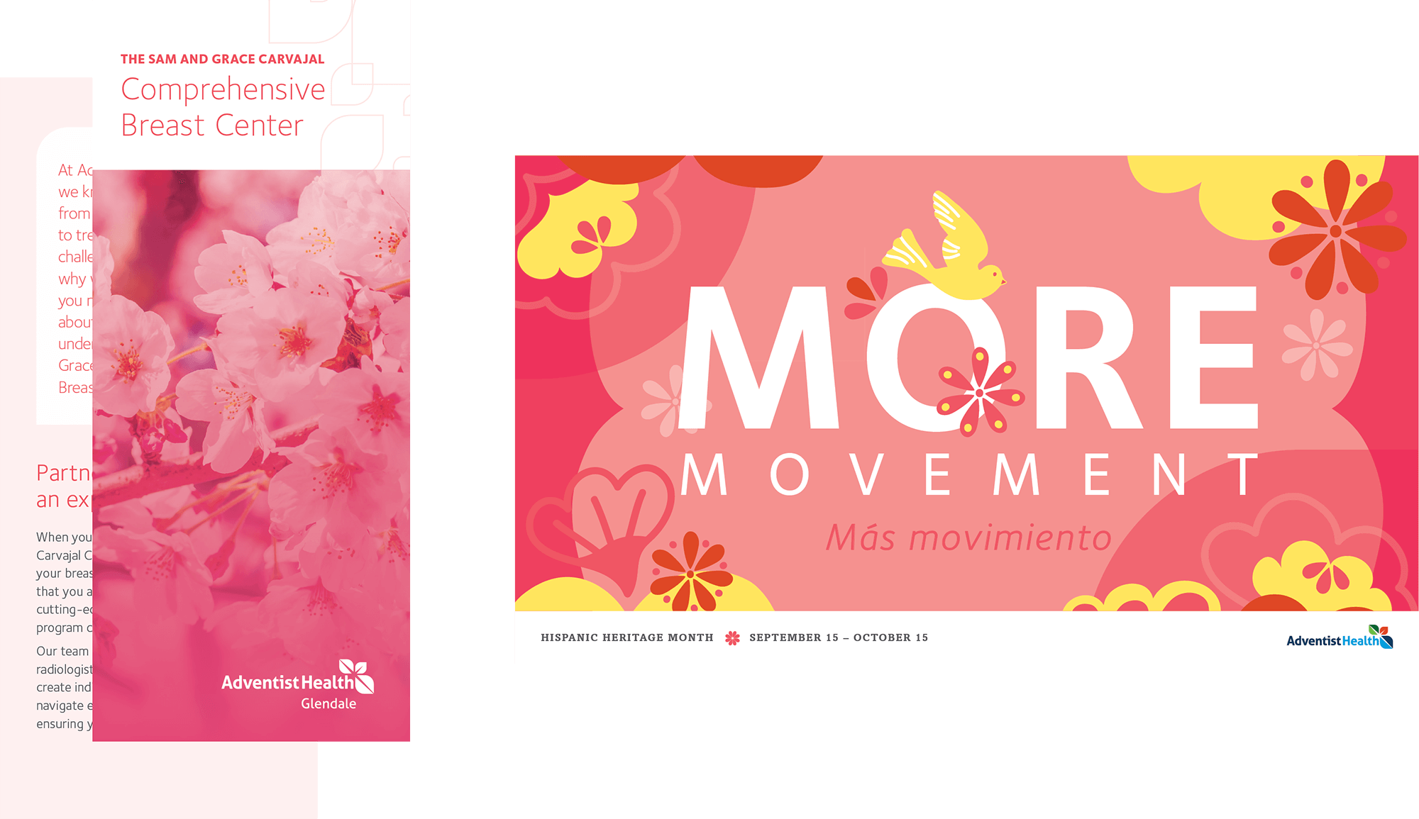
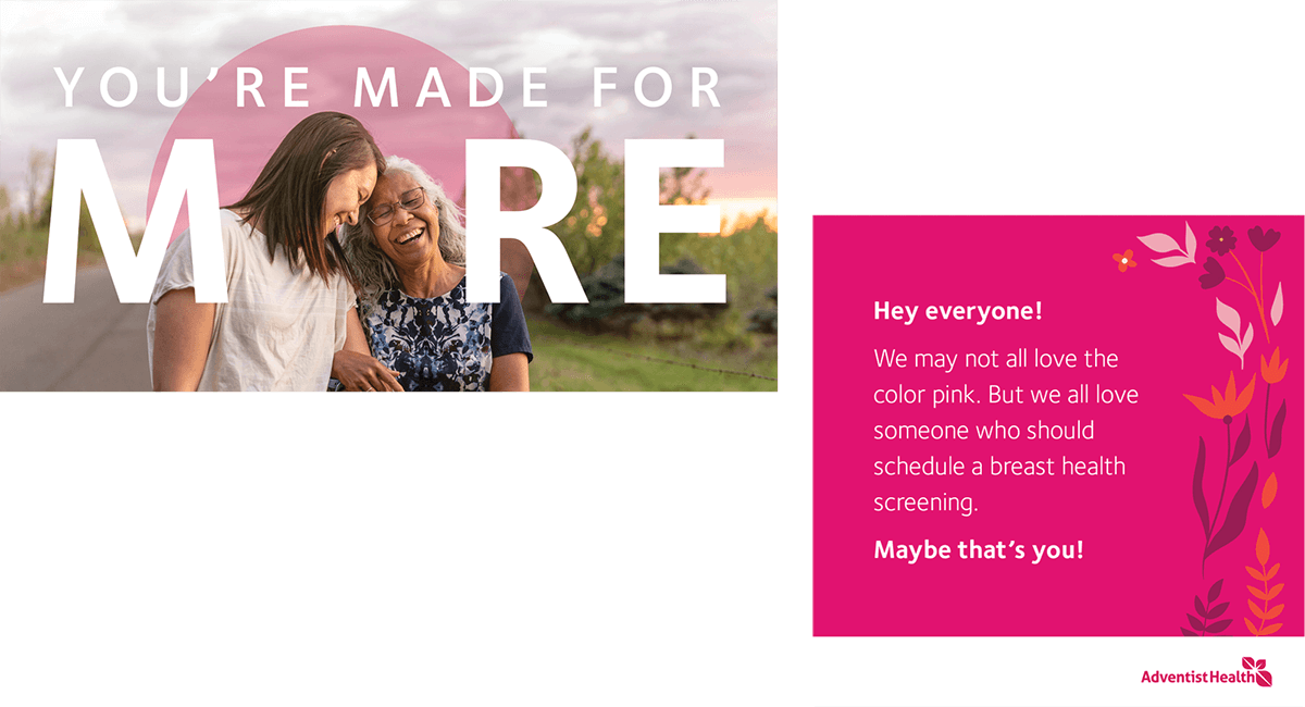
- Breast Cancer Awareness (BCA) Pink should primarily be used during October. However, it may be used throughout the year on promotional items related to breast cancer awareness and care.
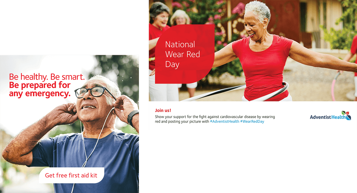
- Emergency Red should be used for items related to emergency services and urgent care. However, it can also be used for heart-focused observances and materials.
BCA Pink
Pantone 213-C
CMYK 9 98 32 0
RGB 219 33 110
HEX #DB216E
ER Red
Pantone 2347
CMYK 0 94 100 0
RGB 225 6 0
HEX #E10600