Logos & Lockups
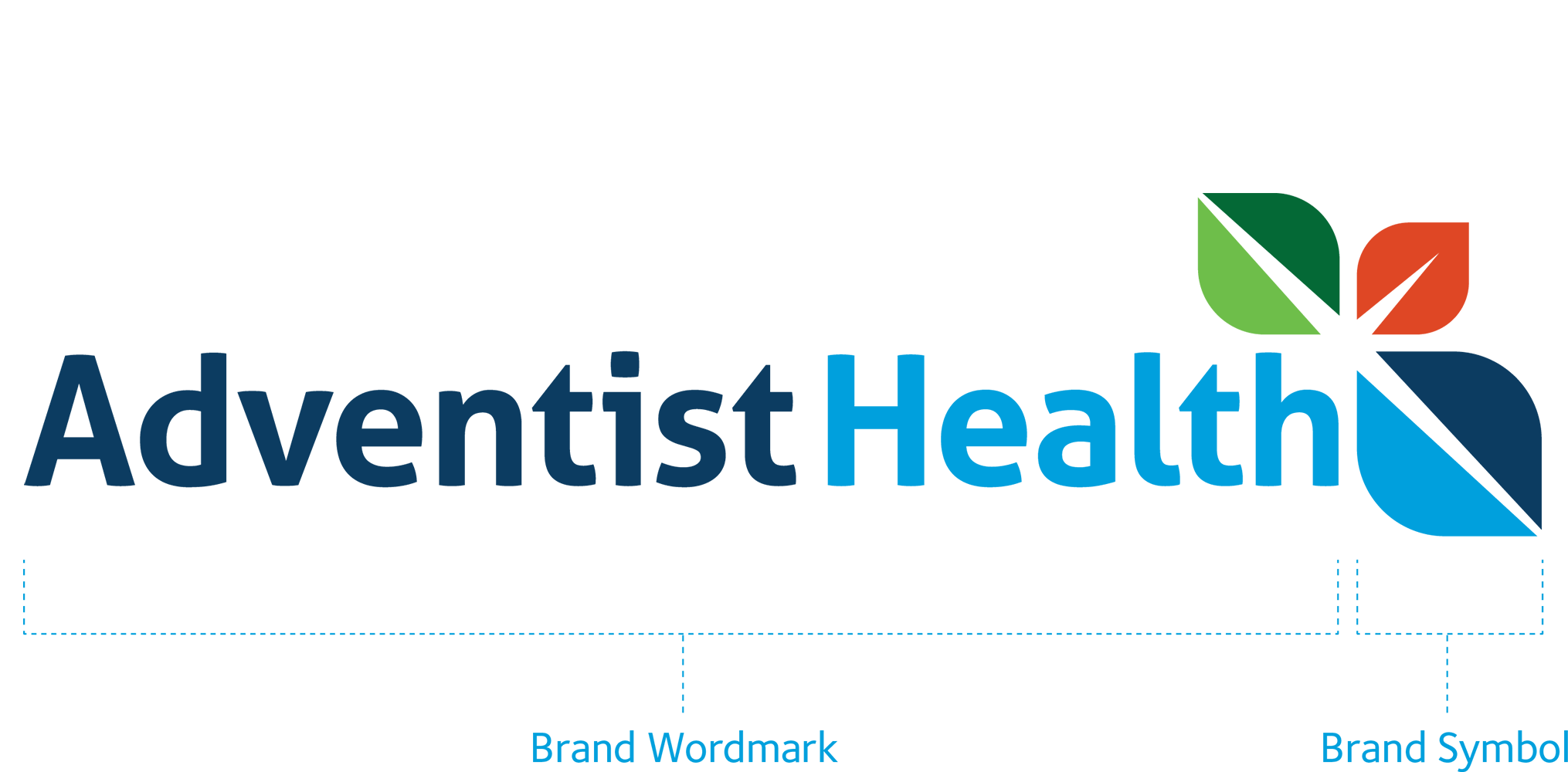
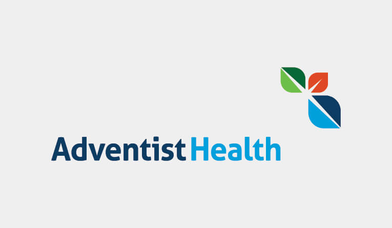
The logo consists of the brand wordmark (the type treatment of our name) and brand symbol (the three multicolored leaves). The wordmark prominently features the word Adventist, connecting to our heritage. The symbol represents life, growth and vitality. It reflects the physical, mental and spiritual elements of whole-person health. Between the leaves, a cross and spark can be found representing God’s ultimate gift of love and our calling to inspire others.
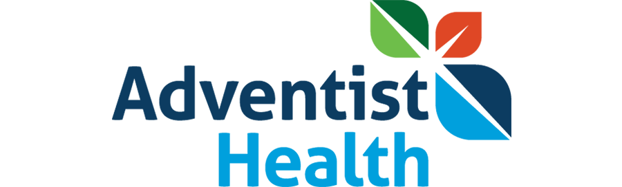
Global Logo
The global logo is the default logo. The horizontal version is preferred but a stacked version can be used on signage, select promotional items or when approved via an email to Brand@ah.org. The global logo should also be used to reference and promote multiple locations and for services, functions or facilities available at multiple locations.
Global (horizontal)

Global (stacked)
For signage and select promotional items only
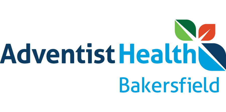
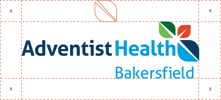
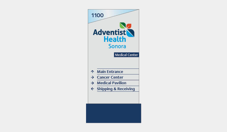
Market Logos
Market logos may be used when referencing or promoting one specific market location or service. Each market has a unique logo in a standardized format that consists of the brand wordmark and symbol above the market’s location name. The horizontal version is preferred but a stacked version can be used on signage, select promotional items or when approved by emailing Brand@ah.org.
Market (horizontal)
Market (stacked)
For signage and select promotional items only

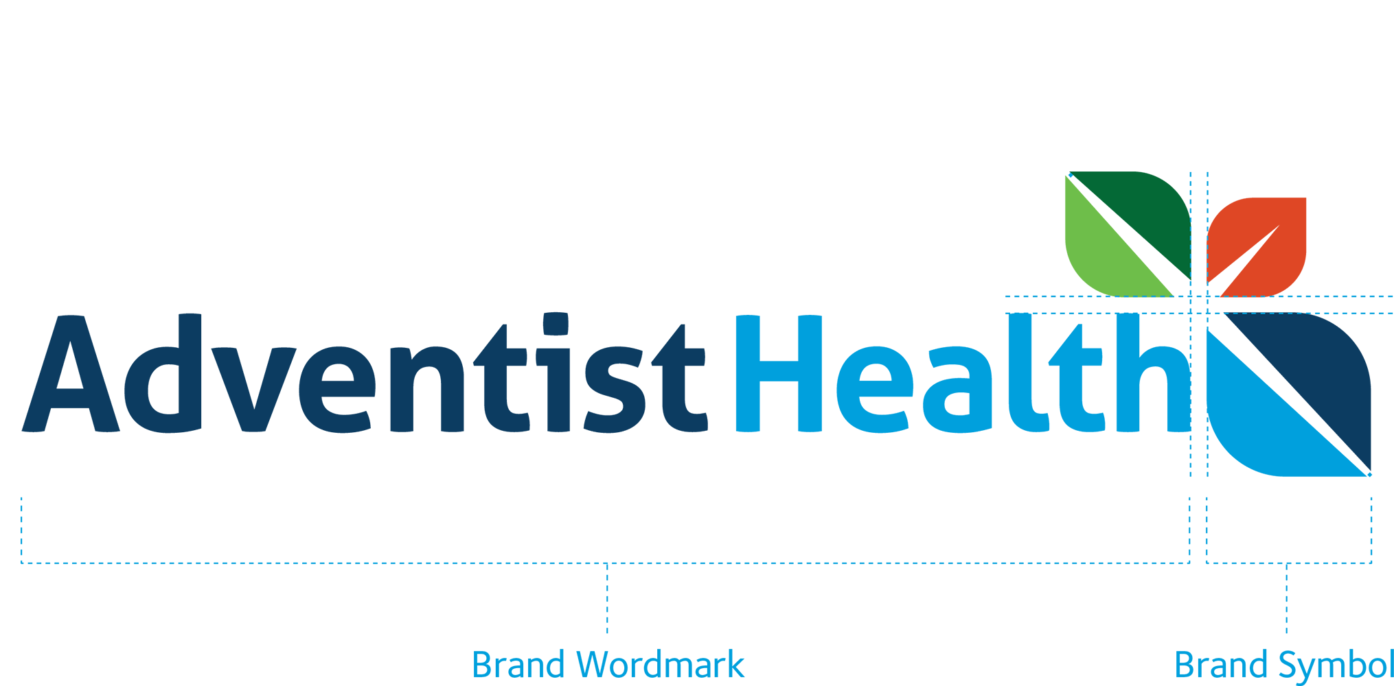
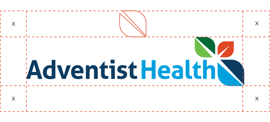
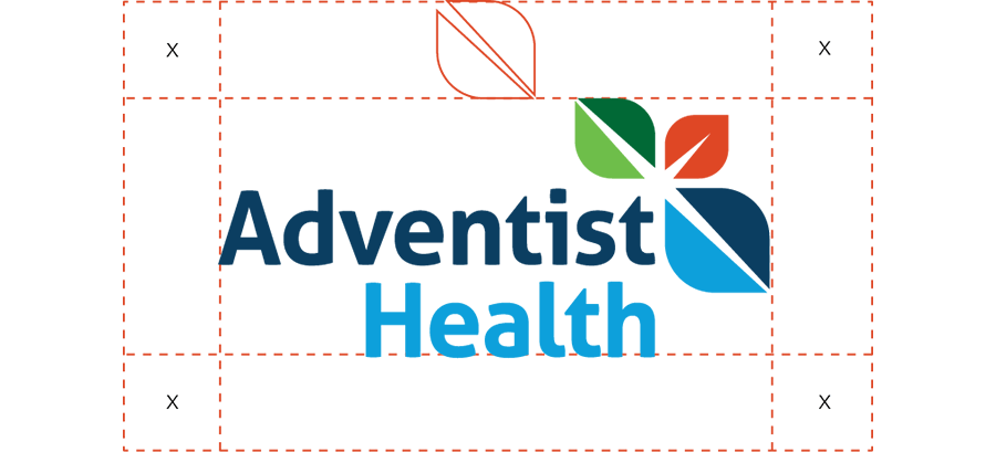
Clearspace
Allow a safe area of white space around each side of the global and market logo. The clearspace should be equal to the size of the largest leaf in the logo’s brand symbol.
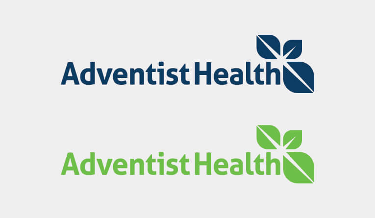
Color
The full-color logo is the preferred logo. To ensure legibility, the logo should be white when placed on a dark color or background. The logo may also appear in black when color printing is restricted.

Scale
For all non-digital uses, the global logo should never be smaller than 1.125 inches wide even when paired with a market. For all digital uses, the global logo should never be smaller than 50px. The stand-alone brand symbol (the three leaves) should only be used for social media profiles or avatars and favicons unless approved by the Marketing Department by emailing Brand@ah.org.
Minimum size of global logo for print

Minimum size of market logos for print

Minimum size for digital (not to scale)

Avatar and favicon for social media and websites
Logo Usage Do’s
Do use the stacked logo only in signage and first get approval from Marketing Department at Brand@ah.org.
Do use the market-specific logo when communicating the services, personnel or location of one specific market.
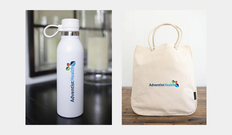
Do use a logo large enough on promotional items.
Do use the white logo over dark backgrounds and images to ensure there is enough contrast.
Do use the global logo in all cases except when communicating the specific services of a single market.
Do use the global logo when communicating services that are shared by more than one market.
Do place the full-color logo on a white, neutral solid or clear area of photos and patterns.
Do use the brand symbol (three-leaves) as social media avatar and website favicon.
Logo Usage Don’ts
Don’t alter the spacing between the brand symbol and the wordmark.
Don’t add graphic elements to the logo or add graphics that break the clearspace.
Don’t use the four-color version of the logo in a monochromatic palette.
Don’t use the wordmark independently of the symbol.
Don’t place the logo at an angle.
Don’t stretch, distort or crop the logo. Keep the correct proportions when resizing.
Don’t use the logo in multiple locations in the same design space.
Don’t use create greyscale verison of the logo. Use the black version instead.
Don’t place the logo on a background above 10% screen of neutral tone.
Don’t place the logo over a complex pattern that compromises its legibility.
Don’t place the logo over a complex image that compromises its legibility.
Don’t create your own logo or lockup.
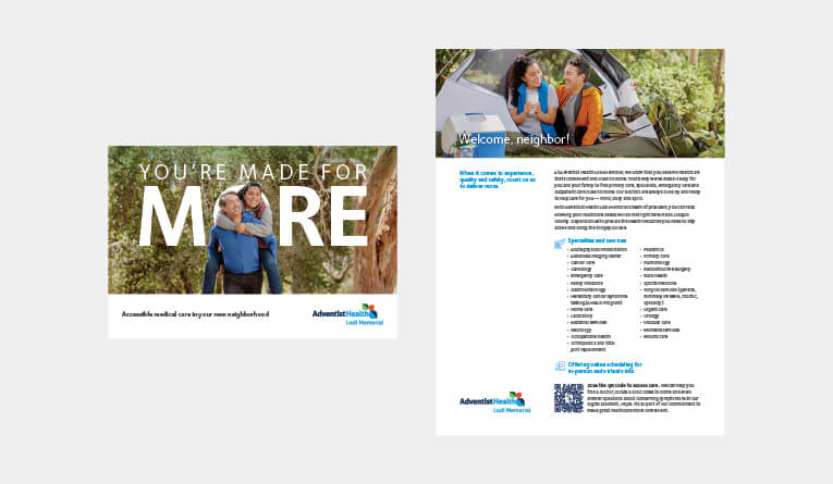
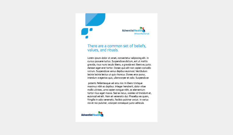
Promotional Item Type Treatments
Departments and services should not create their own lockups with the Adventist Health logo. Department and service names should be separate elements from the logo. However, for select promotional items that require a department or service name, use the following type treatments below the logo with a clearspace of the largest leaf.*
Foundry Sterling Medium flush left solution for market names that hang beyond right of logo
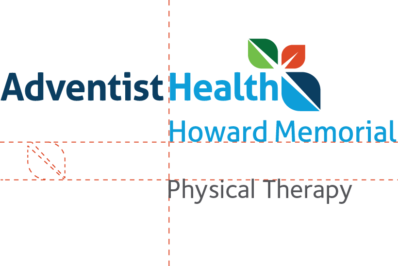
Foundry Sterling Medium centered solution for market names that do not hang beyond right of logo
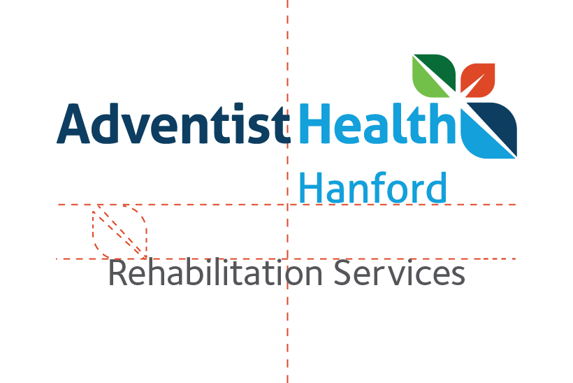
*For creation and use of type treatment, please contact the Marketing Department at Brand@ah.org.
Foundation Lockups
Foundation lockups are only paired with the global logo (not the market lockups) and have a type treatment that is left aligned with the ‘H’ in ‘Health’. They maintain a large leaf clearspace between the logo and type treatment. When aligned horizontally a gray line is centered between the logo and type treatment.*
Foundry Sterling Medium type flush left with the ‘H’ in Health
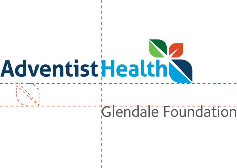
Foundry Sterling Medium type centered horizontally with the logo
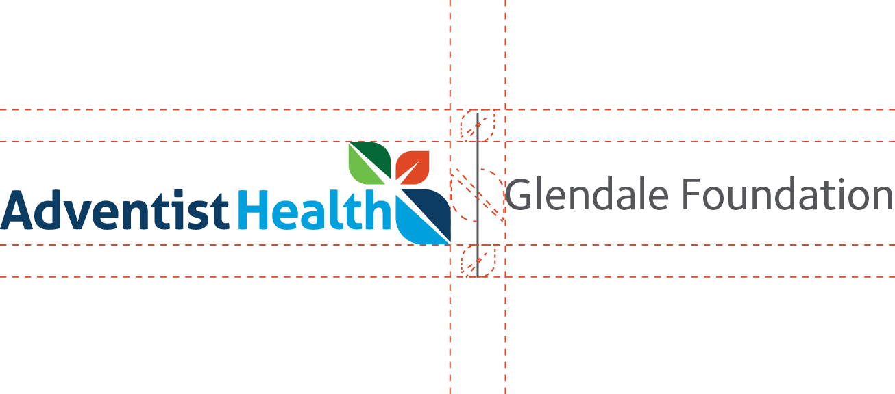
*For creation and use of type treatment, please contact the Marketing Department at Brand@ah.org.
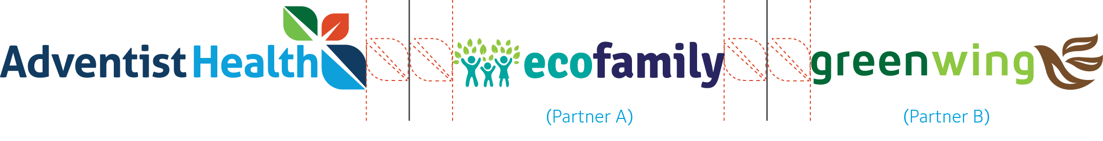
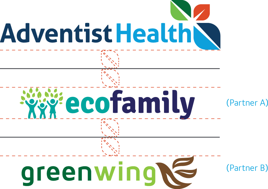
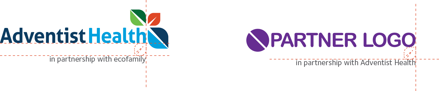
Collaboration Lockups
When collaborating with other brands the logos should be separated with a gray line with a leaf-sized safe area on each side of the line. Depending on the terms of the partnership, the dominant partner should be on the left for horizontal orientation or at the top for vertical/stacked treatments. Additional lines and clear space should be added when featuring multiple partners.*
Partnership (horizontal)
Horizontal partnership logos are separated by a gray line and a large blue leaf-sized safe area on each side.
Partnership (stacked)
Stacked partnership logos are separated with a gray line and a green leaf-sized safe area on each side.
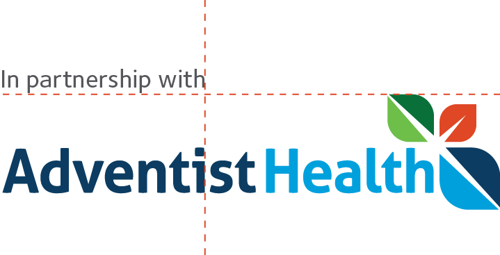
In partnership with Adventist Health
“In partnership with Adventist Health” is flush left with the ‘A’ in Adventist and aligned with the top of the green leaf.
Affiliation (type treatment)
Affiliations with the Adventist Health logo or partner logos use a type treatment that is right flush with the lowercase ‘h’ in Health and a small red leaf safe area.
*For creation and use of type treatment, please contact the Marketing Department at Brand@ah.org.