Typography
Our fonts increase readability, build personality and act as a visual voice for our brand. When used consistently, these fonts help unify messaging, create familiarity and make a distinctive visual impact.
Primary
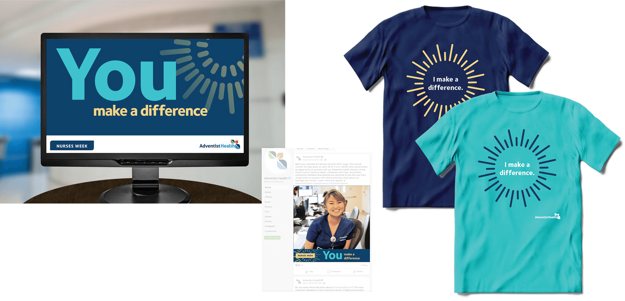
Foundry Sterling is our primary typeface and should be used to create materials for external audiences. For body copy, use Foundry Sterling Book styled with ample leading for legibility and readability. This typeface should be used on most of the materials produced, including advertisements, signage, social media, etc.
Foundry Sterling is our primary font for headlines and body copy.
Foundry Sterling is our primary font for headlines and body copy.
Foundry Sterling is our primary font for headlines and body copy.
Foundry Sterling is our primary font for headlines and body copy.
Foundry Sterling is our primary font for headlines and body copy.
Foundry Sterling is our primary font for headlines and body copy.
Secondary
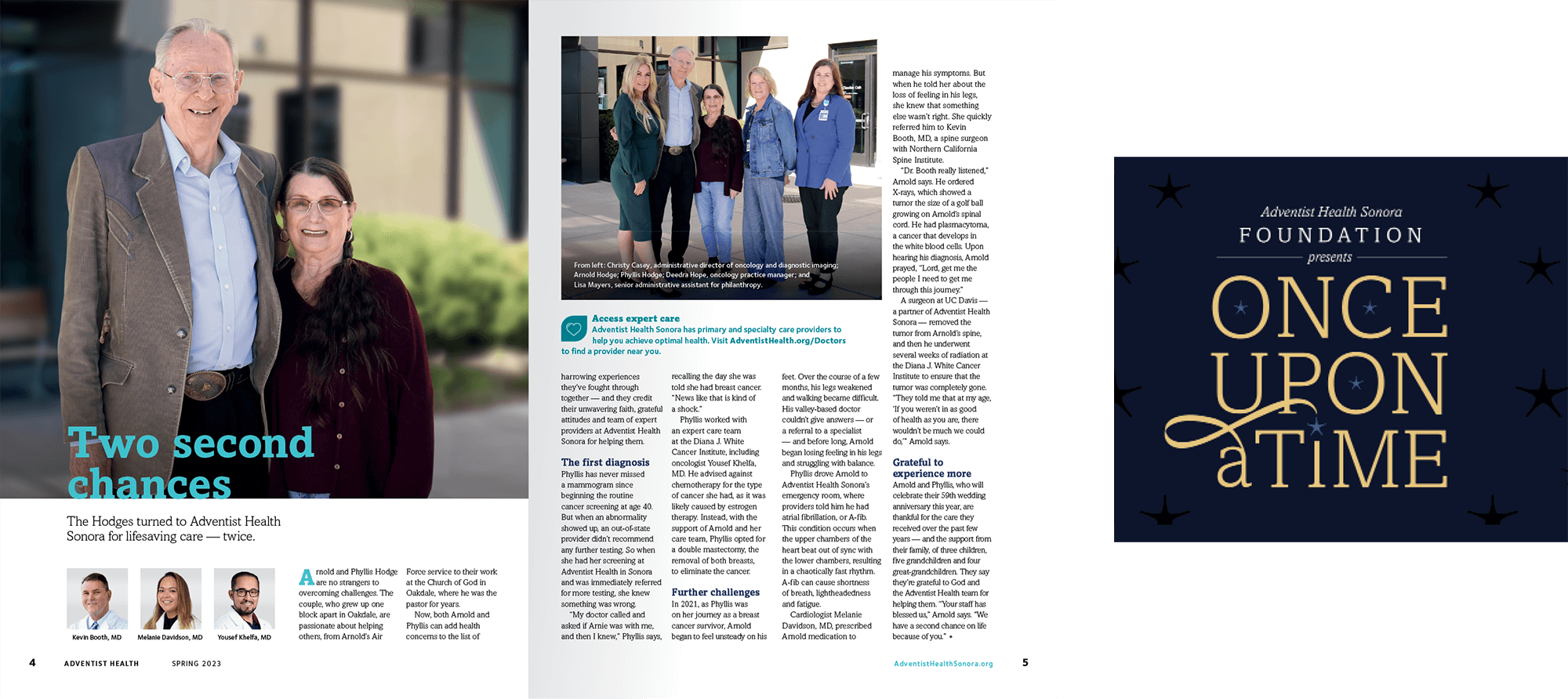
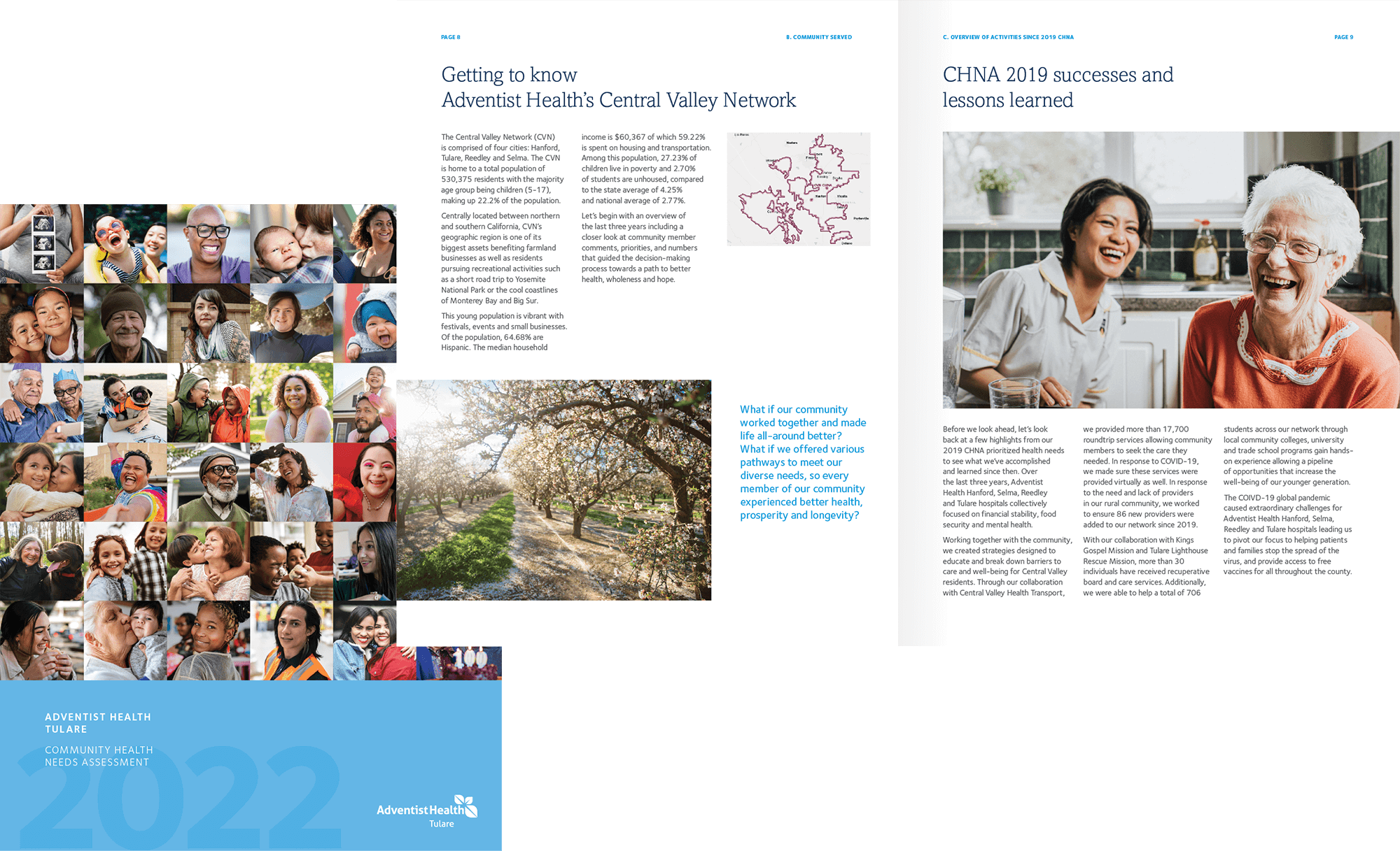
Amasis MT Std is our secondary typeface and is primarily used as body copy in long-format publications such as newsletters, magazines and patient education materials. Occasionally, Amasis is used for expressive items such as invitations or themed event-related pieces.
Amasis MT Std is our secondary font for body copy and long-format publications.
Amasis MT Std is our secondary font for body copy and long-format publications.
Amasis MT Std is our secondary font for body copy and long-format publications.
Internal Communication
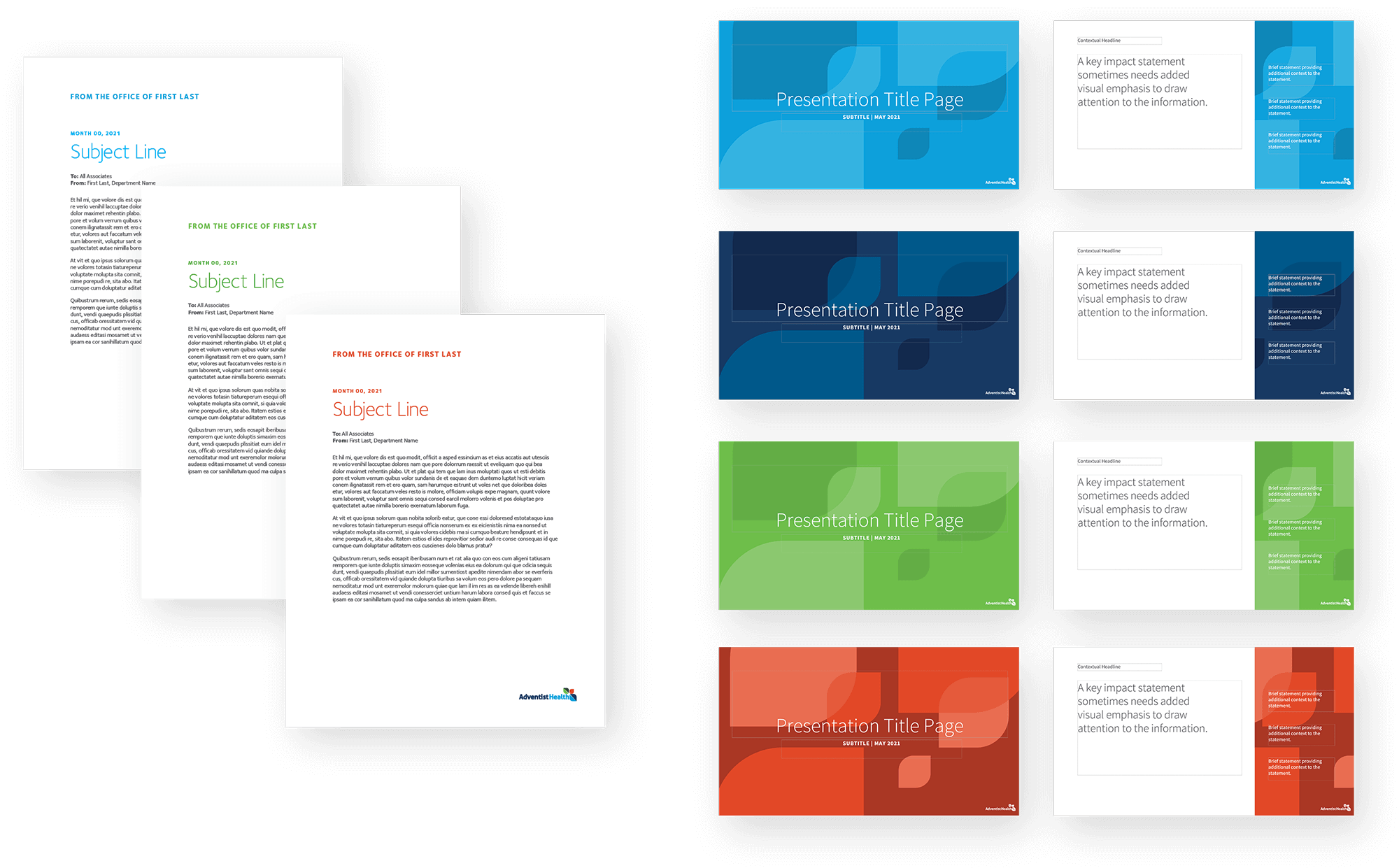
Source Sans Pro is the default typeface for internal communication, and it is primarily used on items built within the Microsoft Office suite, such as PowerPoint and Word.


